Branding Design for a Portuguese Kids’ Clothing Store
“Working with Amber on creating my company logo was great! Communication was very easy and her work is very professional. She always accepted my suggestions, gave me good options, and captured my vision well. I really recommend her.” | INÊS FONSECA
CLIENT
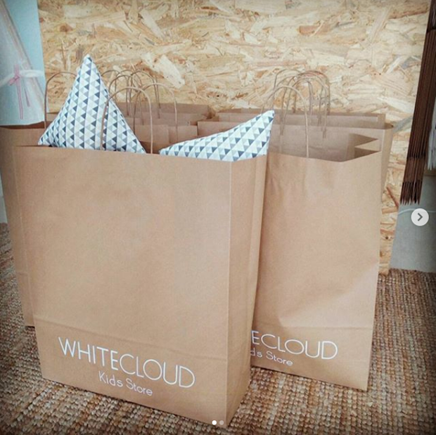
- WHITE CLOUD KIDS STORE | Inês Fonseca, small business owner
- Lisbon, Portugal
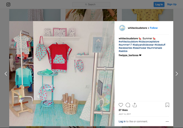
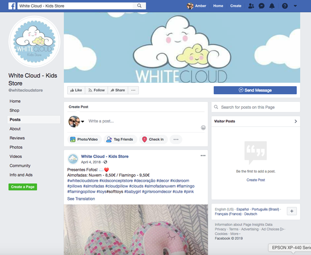
- FACEBOOK SHOP
PROJECT
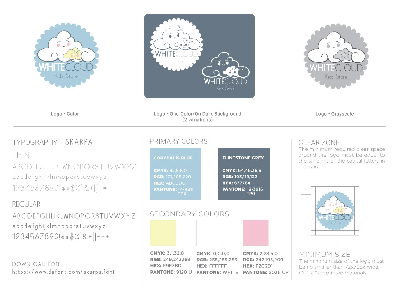
- Graphic Design: Illustrative Logo design
- Illustration: 4 variations of the “child” cloud
CHALLENGE
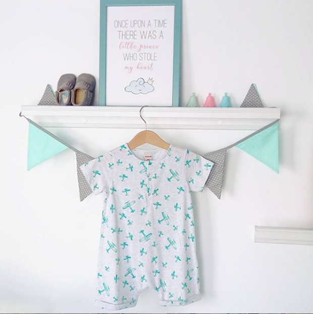
The client was looking for a brand that demonstrated lightheartedness and approachability. She wanted it to look childlike yet professional. She knew she wanted clouds and something to represent her knitting skills as a lot of the products in her shop are handmade by her. The brand needed to be applicable to both print and digital media.
SOLUTION
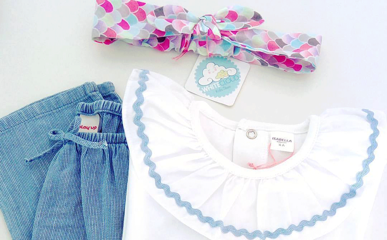
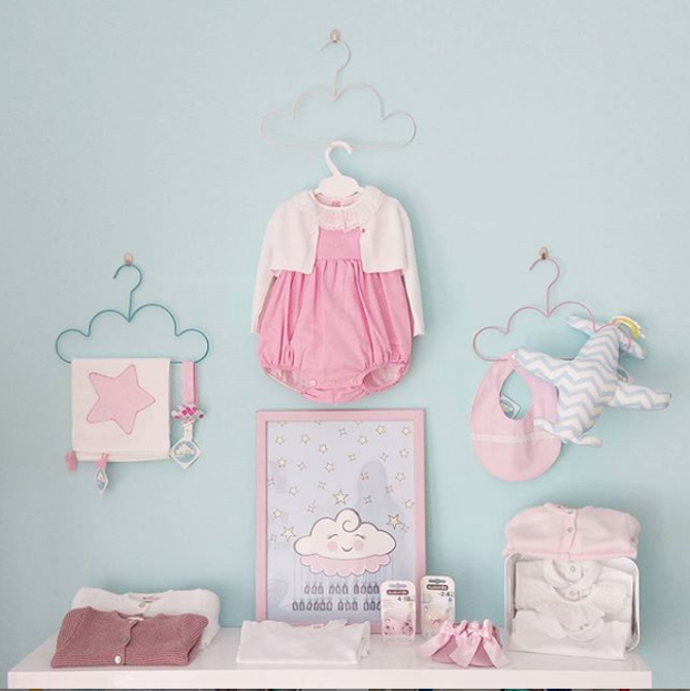
I came up with a “mother and child” cloud illustration that gave the brand the whimsical feeling the client was searching for. The color palette, primary pastels harkens to our inner child. Lastly the scalloped circle hints at crochet/knitting.
The client returned later that year asking for variations of the illustration of the “child” cloud. She has different clothing lines and wanted to have a different illustration for each line.


RESULT
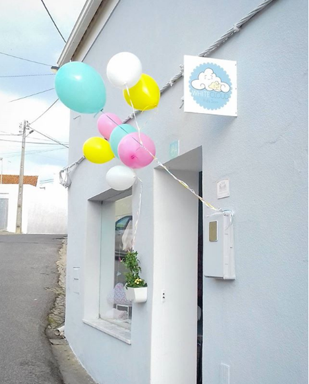
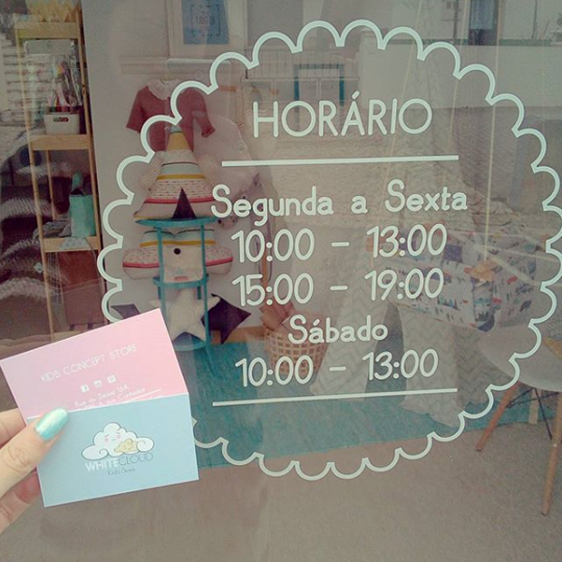
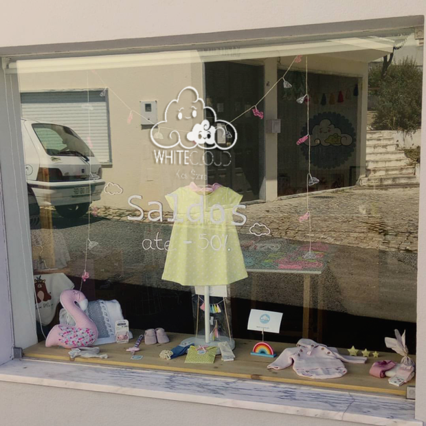
After many years the business continues to be successful. The mark and additional illustrations have been used in many ways in many mediums and surfaces.
ADDITIONAL LINKS
SHOP: WHITE CLOUD STORE
INSTAGRAM: FOLLOW WHITE CLOUD KIDS STORE